When I started this project, I began to think of what data I had collected over the years that describe me. I thought about using my fitness data, my eating habits, but when I remembered that my brother had bought an ancestry kit from 23andMe, I decided to take a look at the data.
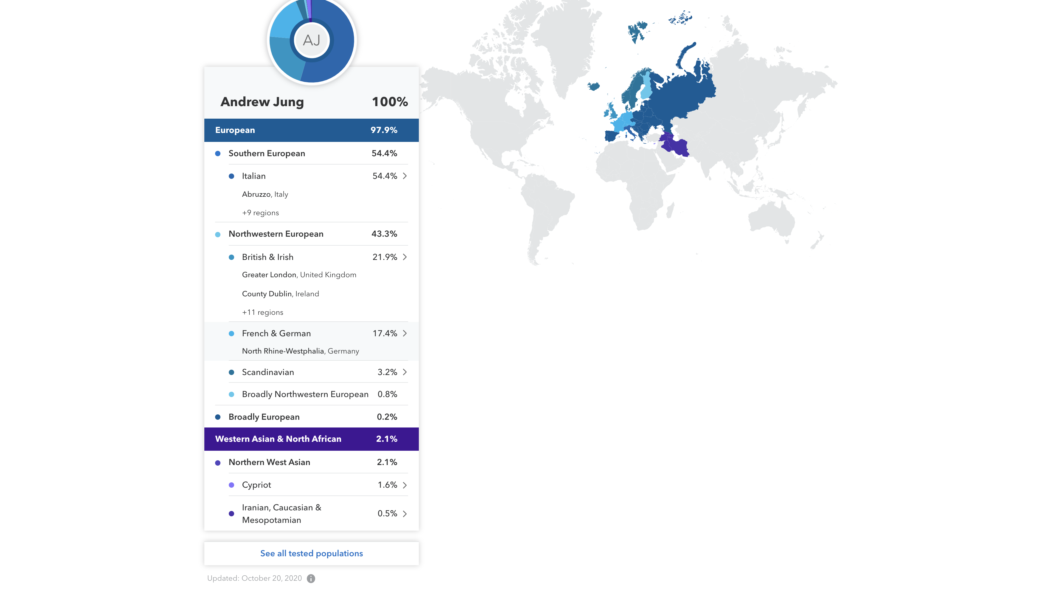
When I viewed data, it felt very impersonal and I wanted to find a way to make it feel more representative of me. 
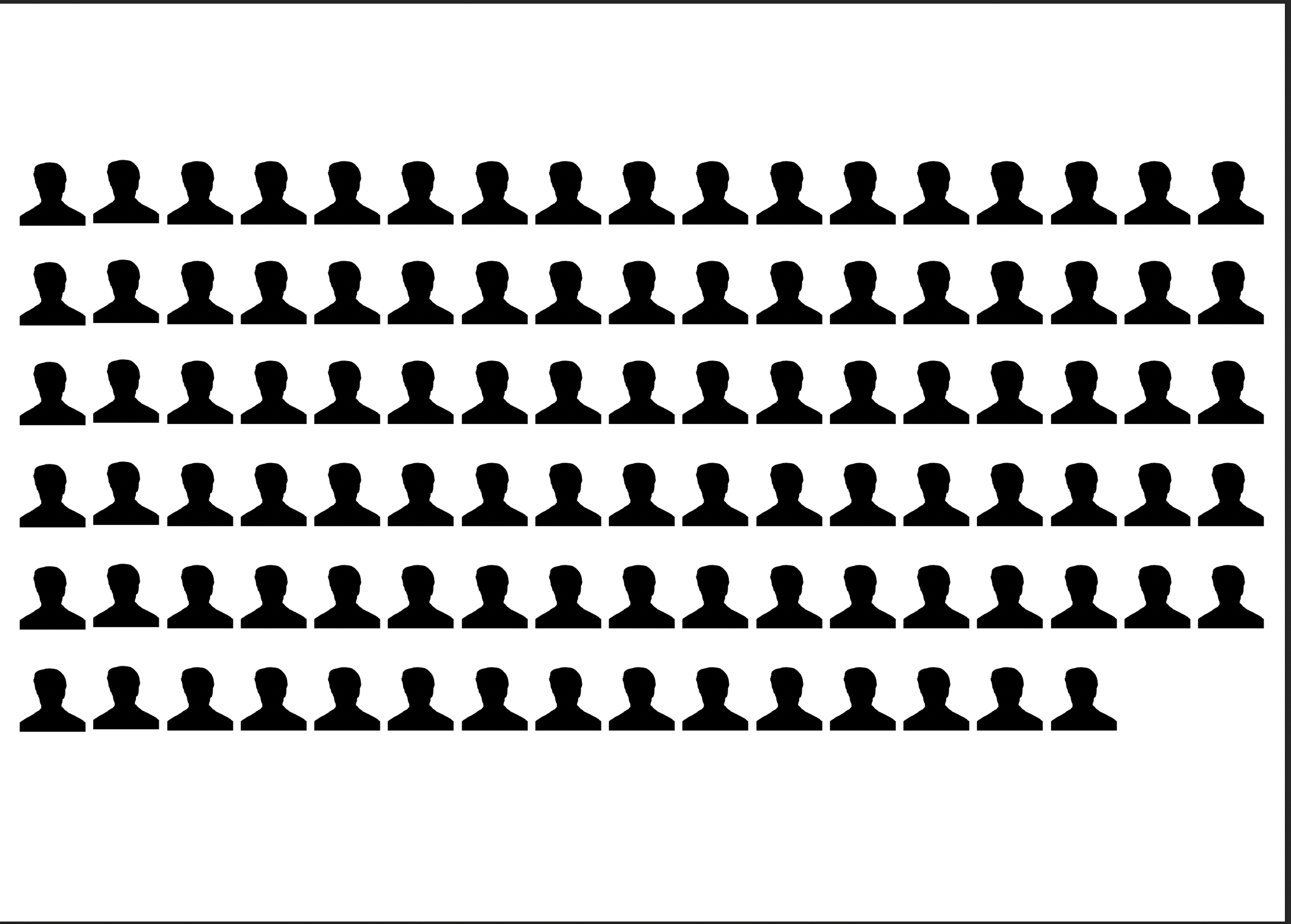
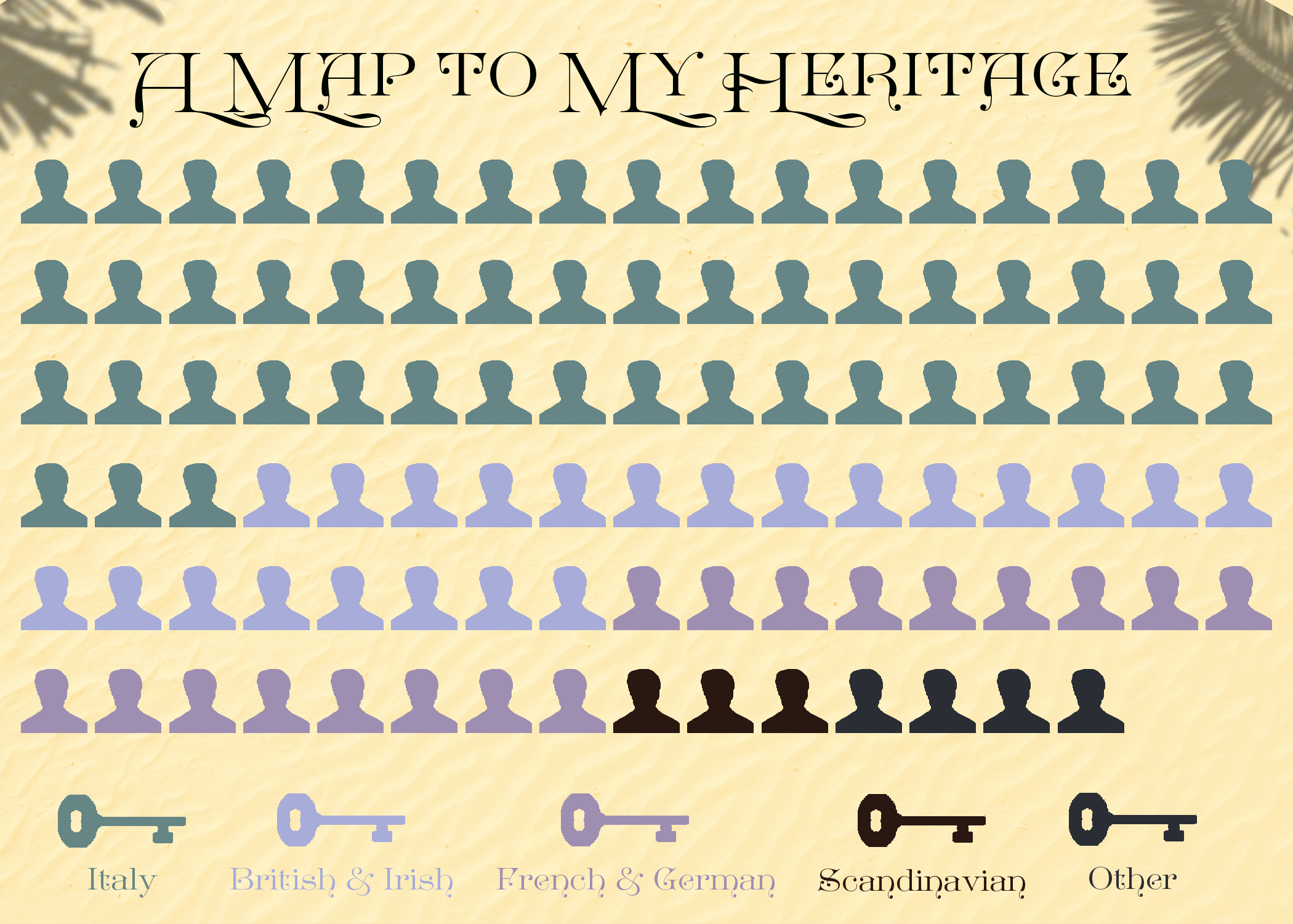
I began with this headshot of myself and I originally thought about making myself into a sort of pie-chart.

So I masked myself into this image and began thinking about fading it. After discussing with Professor Field in office hours, I realized there was no good way to measure the various areas, so I decided that I would try and duplicate myself 100x.
Since I was more familiar with the grid features, I duplicated myself in photoshop to make the following image:
Next, I wanted to look for an interesting color scheme that would work with the data.
Inspired by a show that I had been watching and this palette, I decided that I wanted to have a papyrus / ancient treasure map look to my work.
Using the papyrus shade as input, I then used this randomized color scheme tool to create my own palette. I went through it a few times till I found colors that I liked.
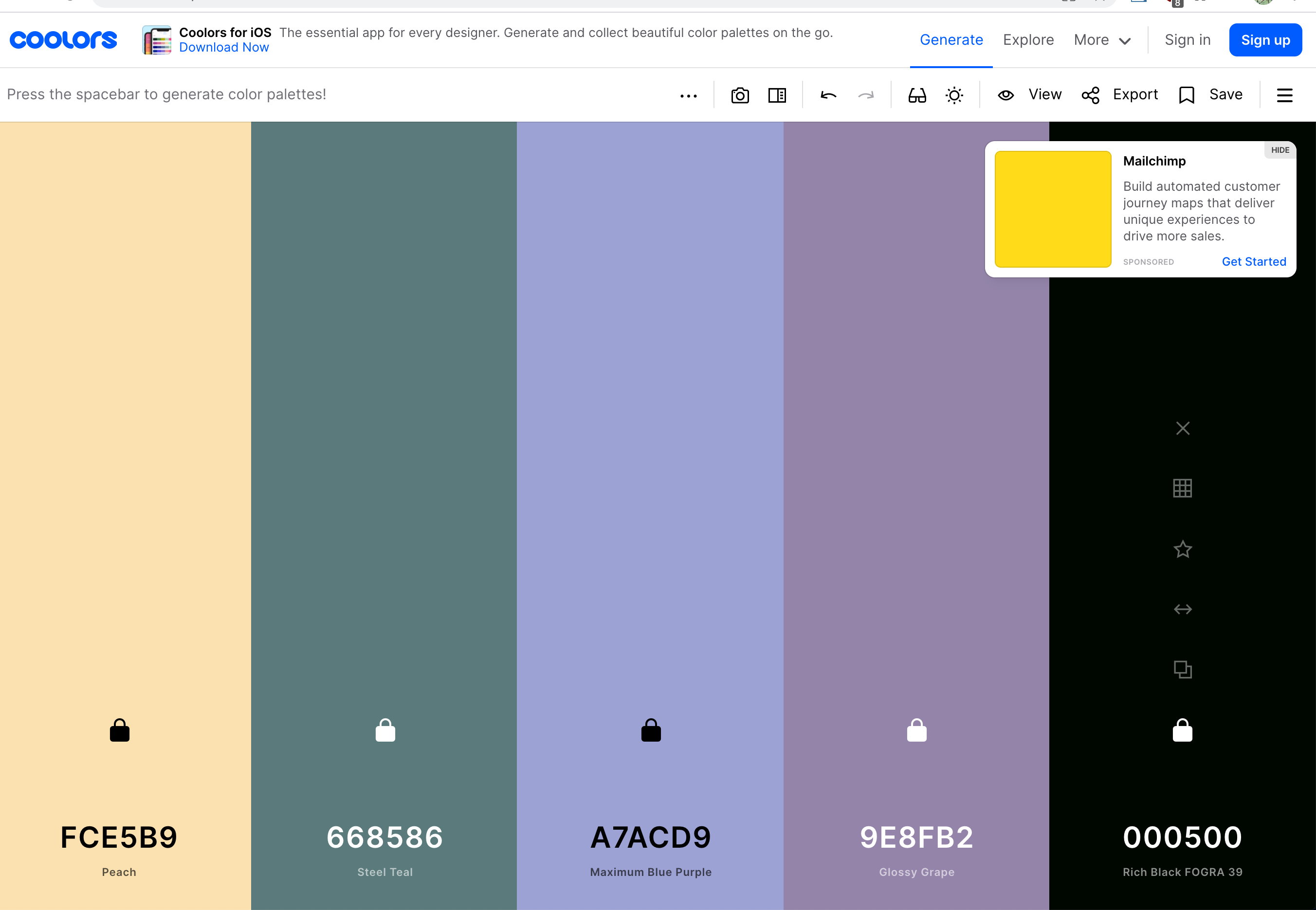
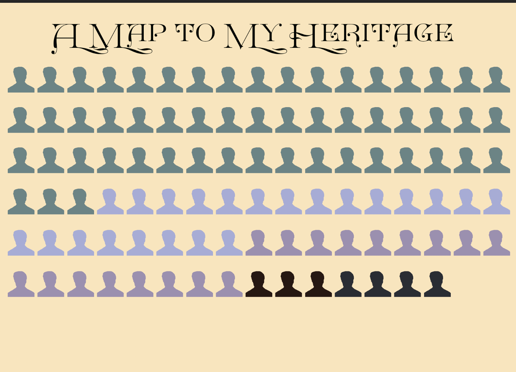
Then, I colored the images accordingly. 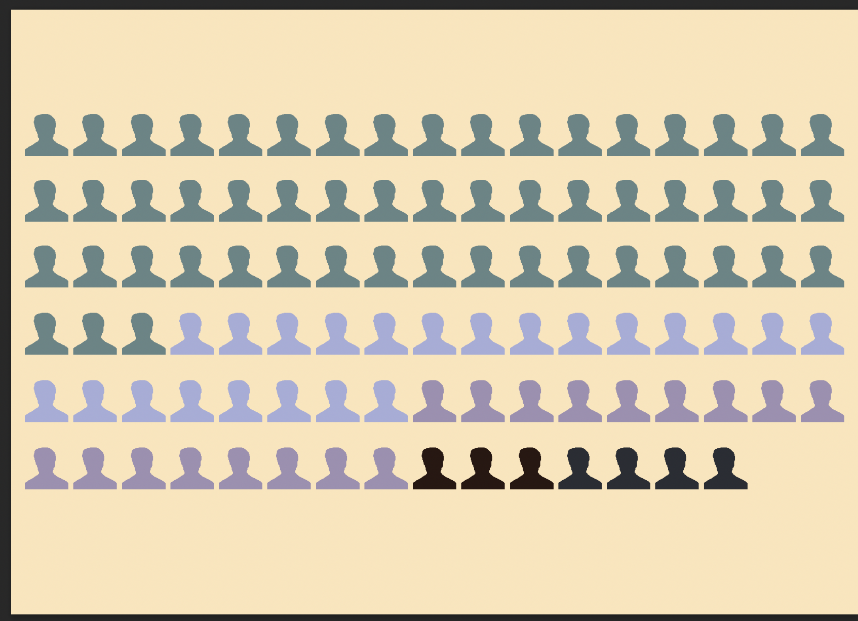
Next, I downloaded a font called great victorian to give it a more treasure map field.
Then I wanted to add a map key, and to amuse myself, I added actual keys that looked ancient looking.
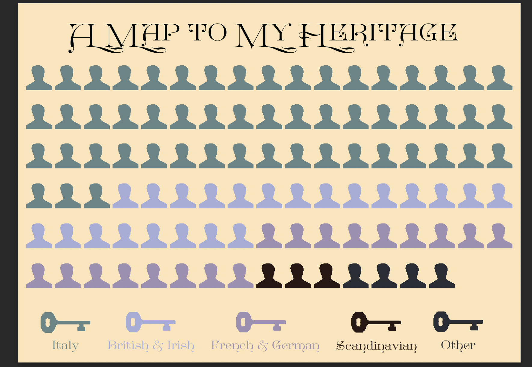
To finish off the treasure map effect, I added sand with an overlay effect and put palm leaves in the background .
Ultimately, I was incredibly happy with the way it turned out.